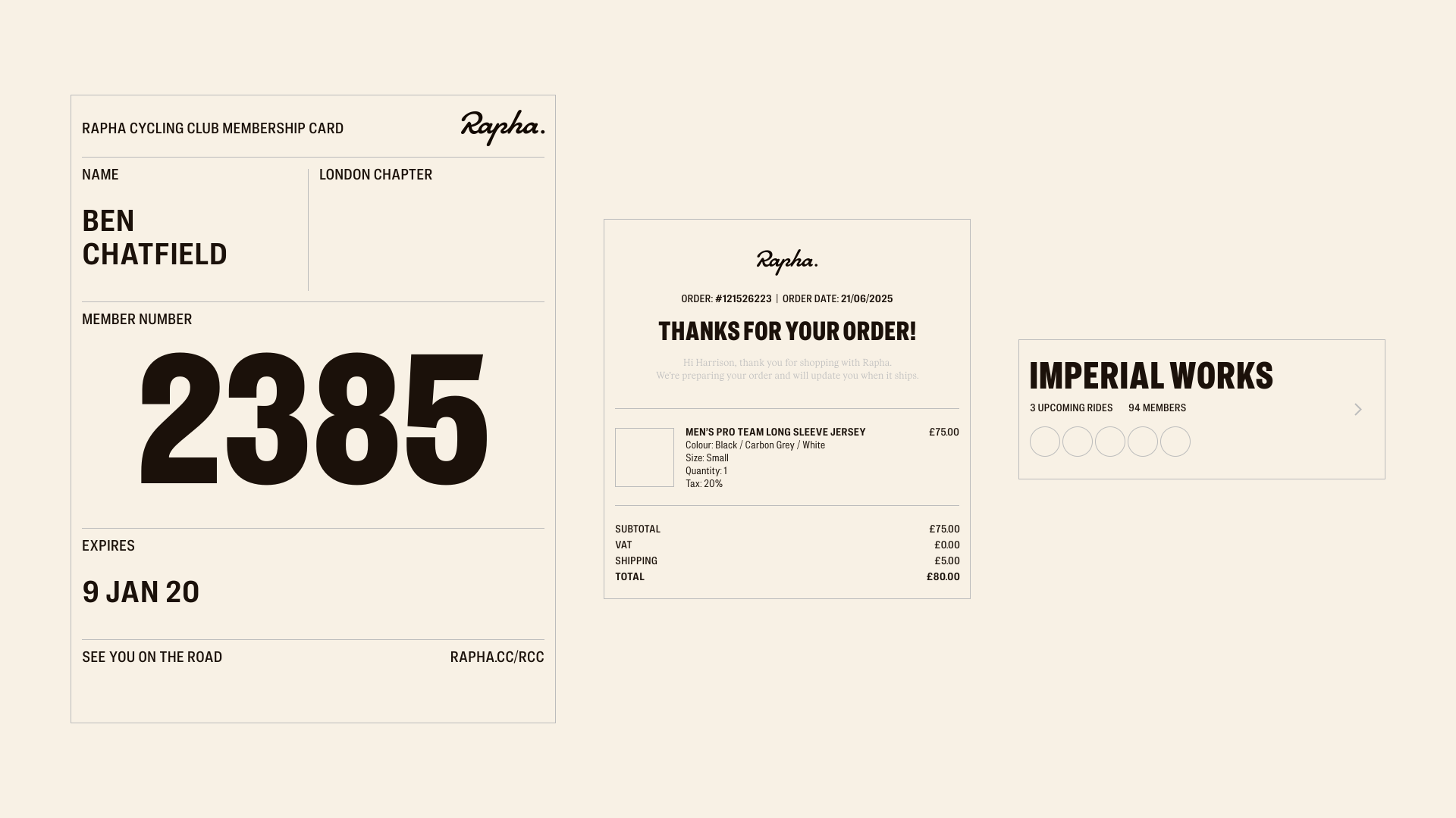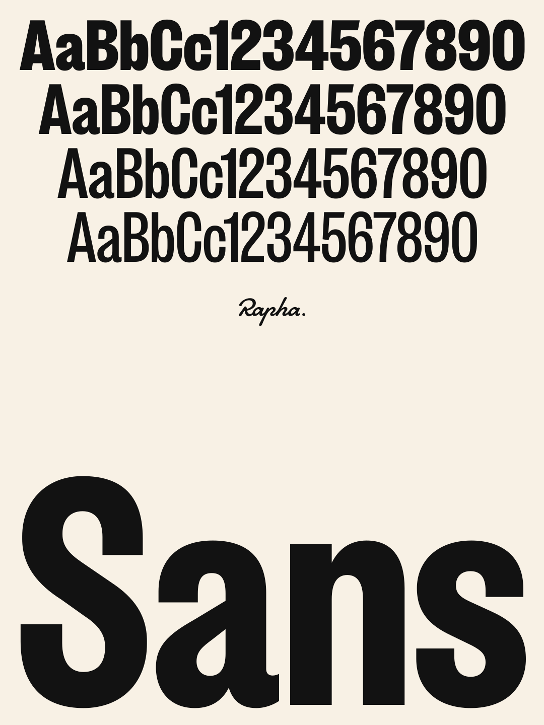
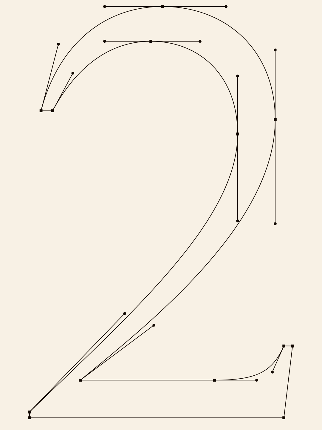
Bespoke type family for Rapha as part of a wider rebrand focused on re-establishing them as the voice of cycling. Shaped through close collaboration and research with Six, the new type family draws on cycling’s visual heritage without being constrained by it. The goal was purpose, not novelty, with every detail designed to bring greater clarity, flexibility, and range to the brand.
RAPHA ... Client
SIX ..... Agency
2026 .... Year


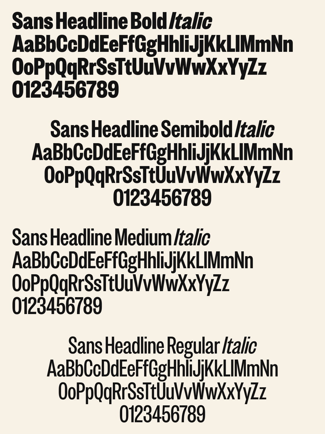
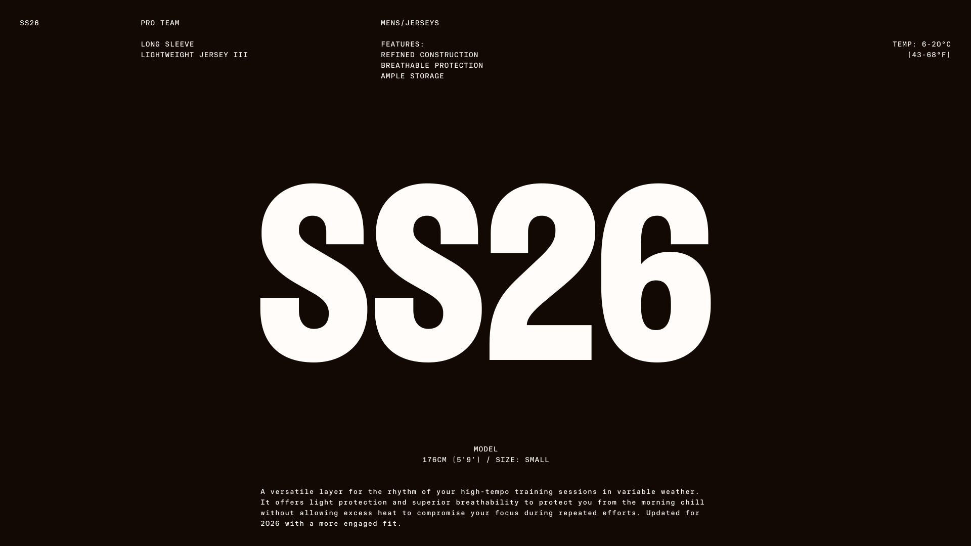
Our lead typeface sets the pace. Designed to carry stories with strength and subtlety, it reflects the clarity and confidence of Rapha at its best: direct, expressive, and impossible to ignore. It’s design draws from the bold typographic voices of the 70s, 80s, and 90s sports advertising, where type didn’t decorate, it declared. Every character is tuned for impact and readability, built to lead in campaign headlines, editorial features, and moments that demand presence. More than a font, it defines Rapha’s voice. It speaks across abilities, cultures, and generations of cyclists, giving the brand a visual tone rooted in heritage, but never defined by the past.
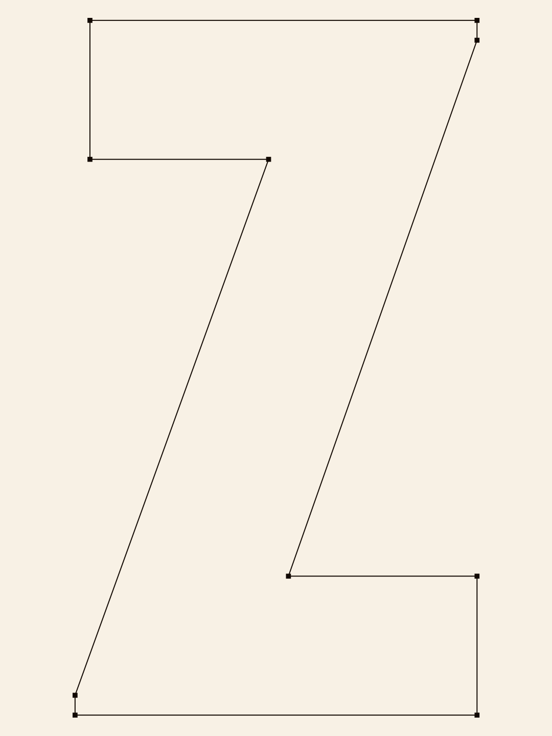

THE LEADING TYPEFACE, RAPHA SANS DISPLAY


From the very start, the process of producing the typeface was highly collaborative between ourselves, Six, and Rapha. Each iteration of the typeface was reviewed and anaylised every step of the way. Each detail in all the letterforms were slowly considered. Instilling references from the in-depth brand research, whilst maintaining the goal to reperesent the future of cycling.
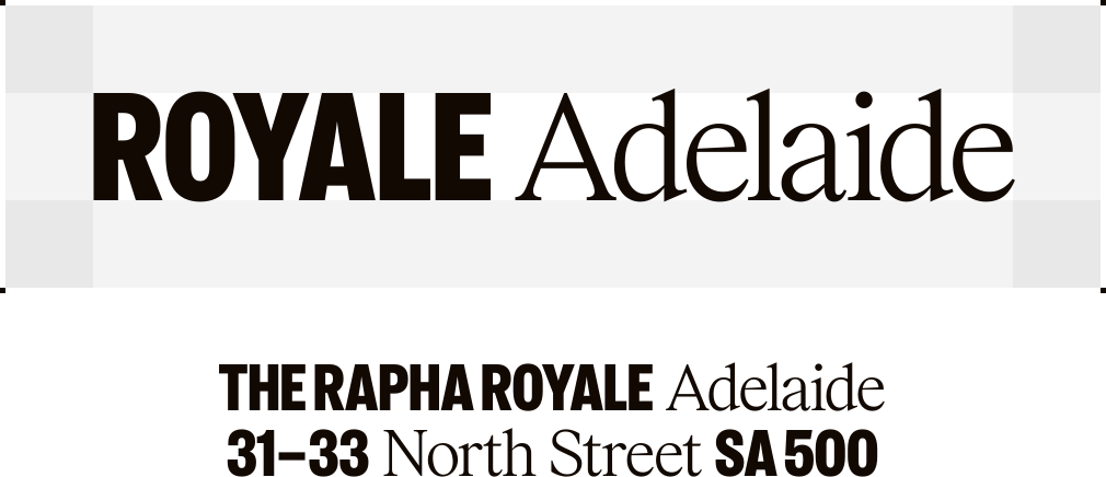
We introduced a number of opentype features that made using brand assets easier. One of those features was the logo ligature. This allows designers to quickly create sub-brands with accurate spacing and scale to meet brand guideline standards, straight out the box.


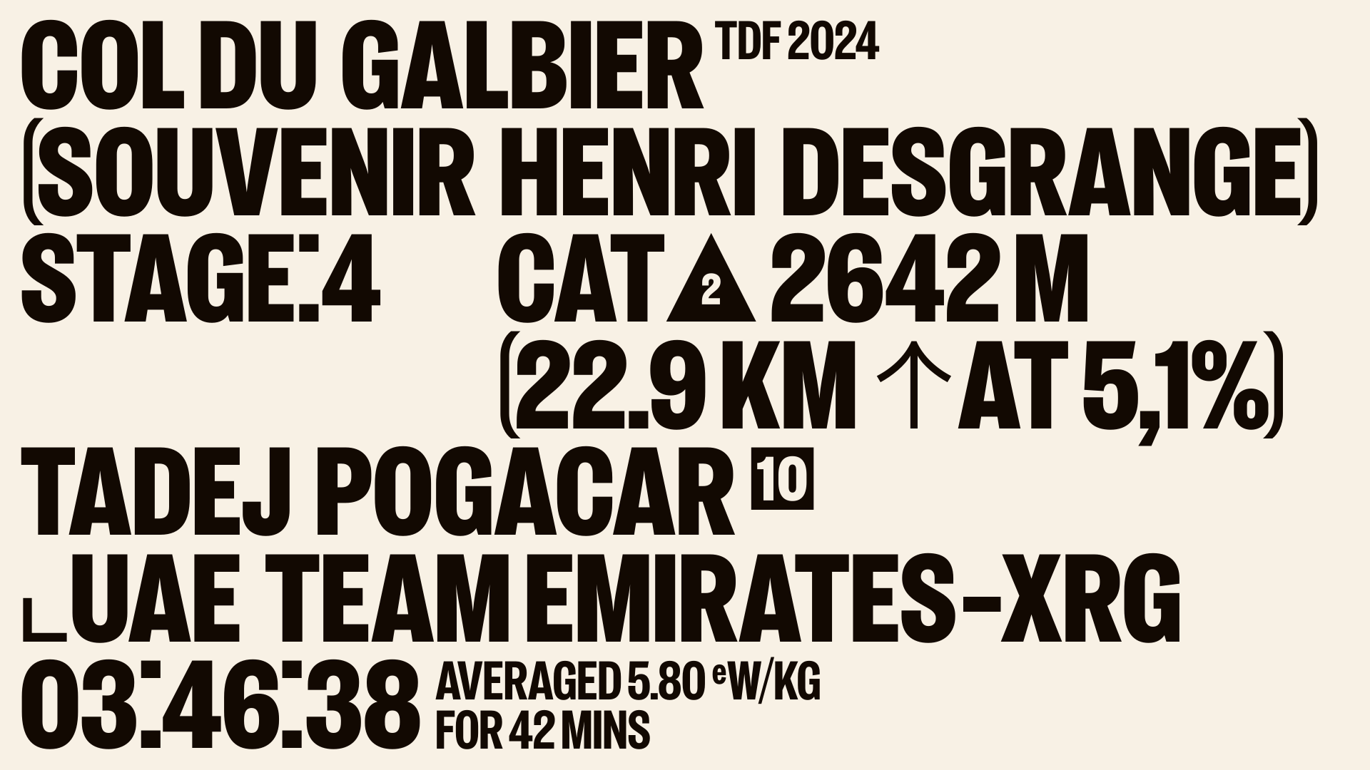

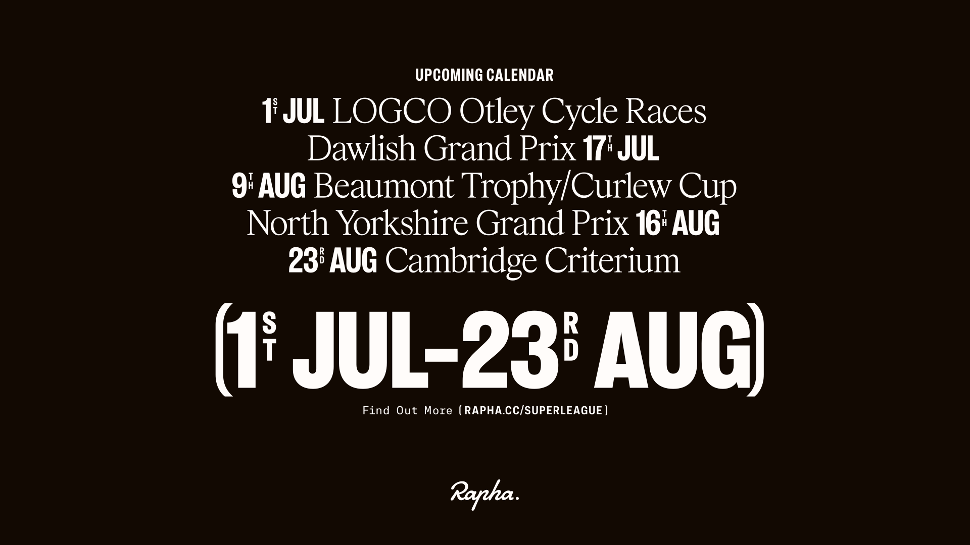
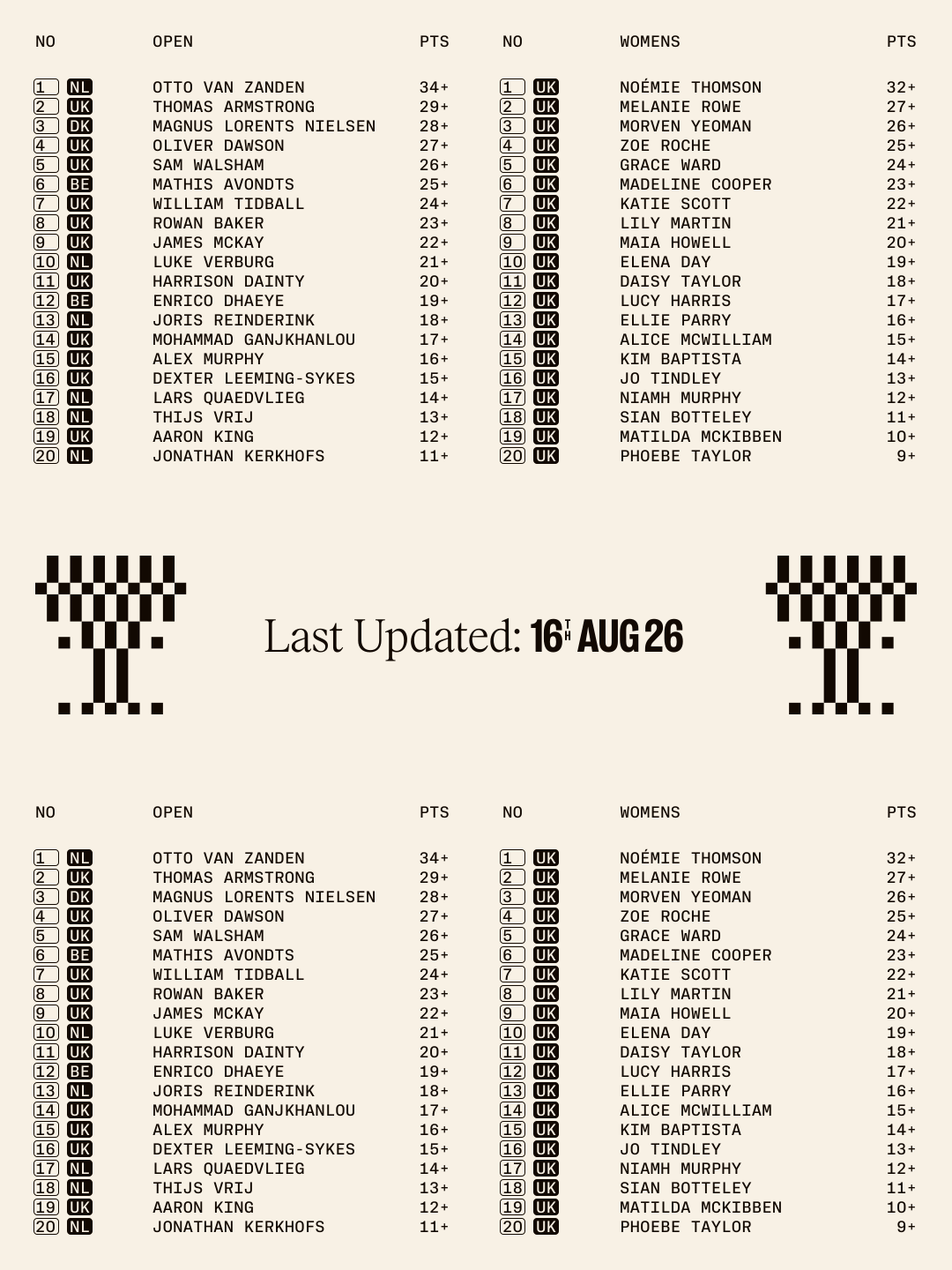
In a sport that use race statistics and metrics so frequently, we introduced superscript ligatures. They can be stacked, set in shapes, or set traditionally. We covered a number of use-cases including, time, speed, distance, race positions, hill climbs, and country codes. This gives the typography system another cohesive, made-to-measure tool.

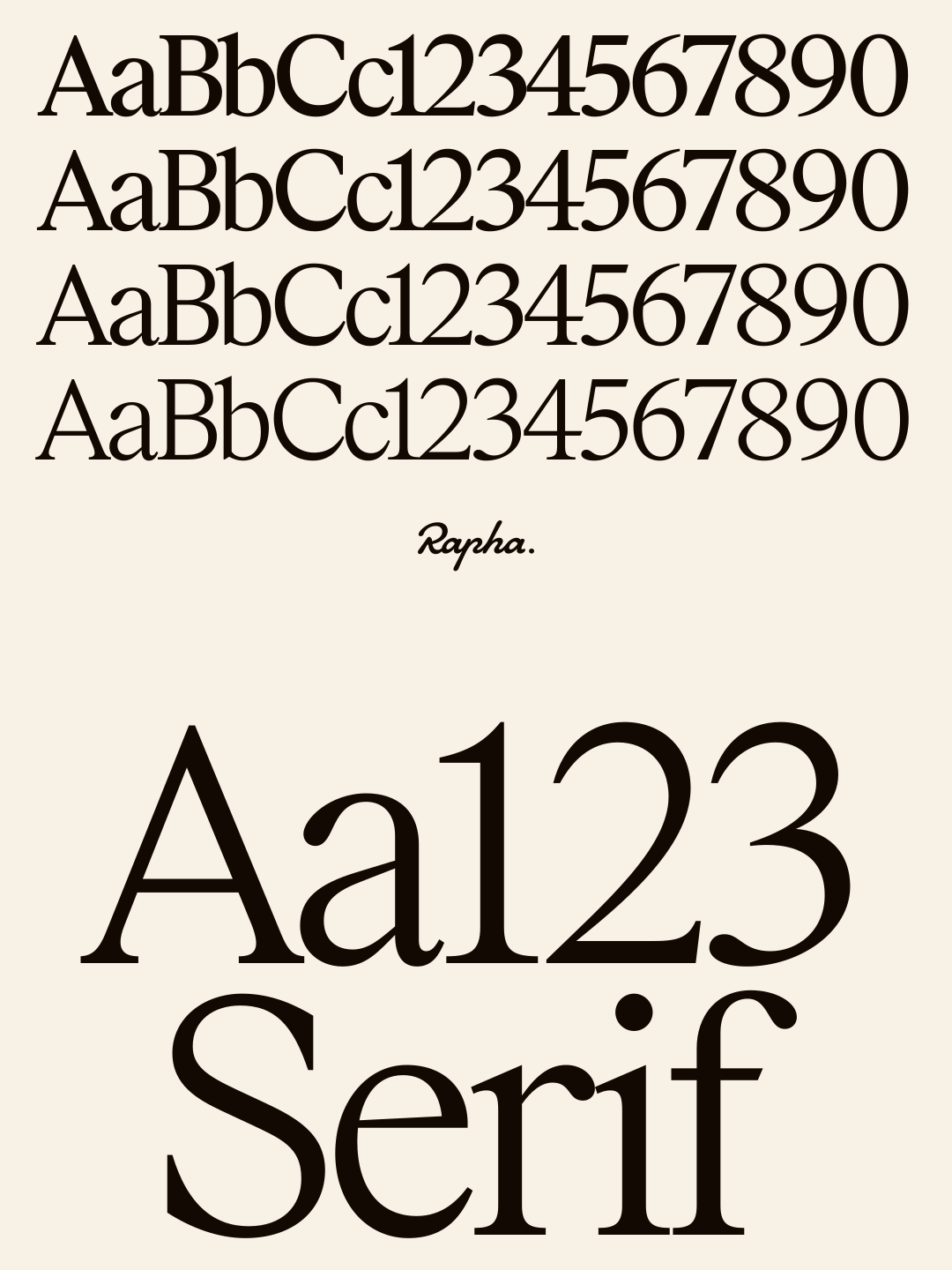
The serif was introduced to the system of typefaces to compliment Rapha Sans. Blah blah blahhhhh. In a sport that use race statistics and metrics so frequently, we introduced superscript ligatures.
They can be stacked, set in shapes, or set traditionally. We covered a number of use-cases including, time, speed, distance, race positions, hill climbs, and country codes. This gives the typography system another cohesive, made-to-measure tool.

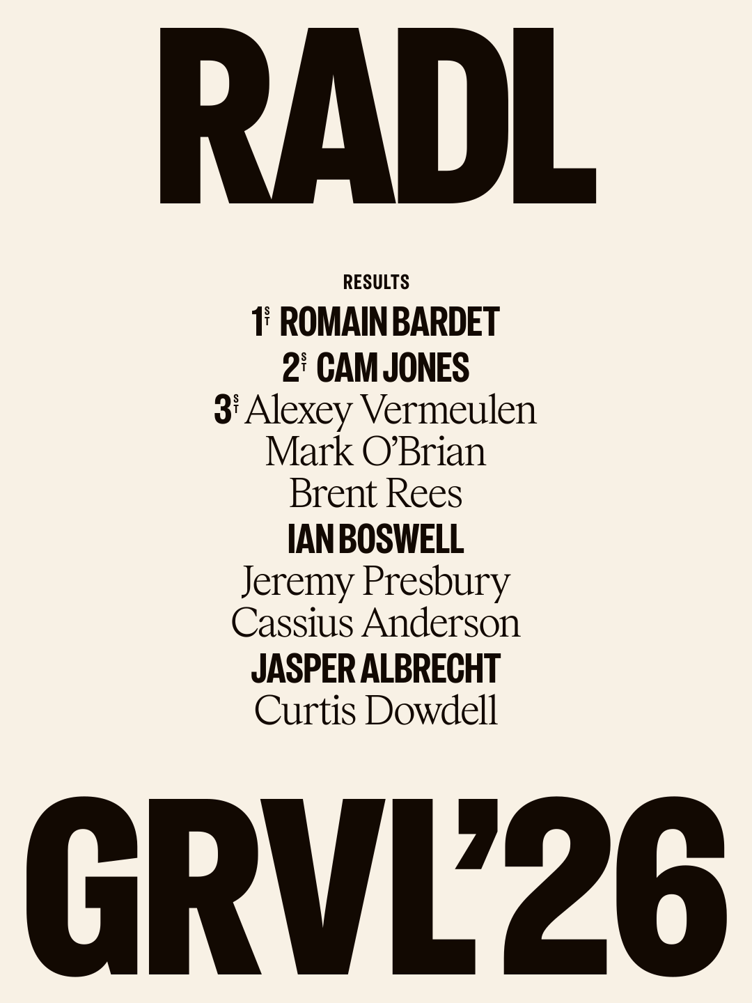


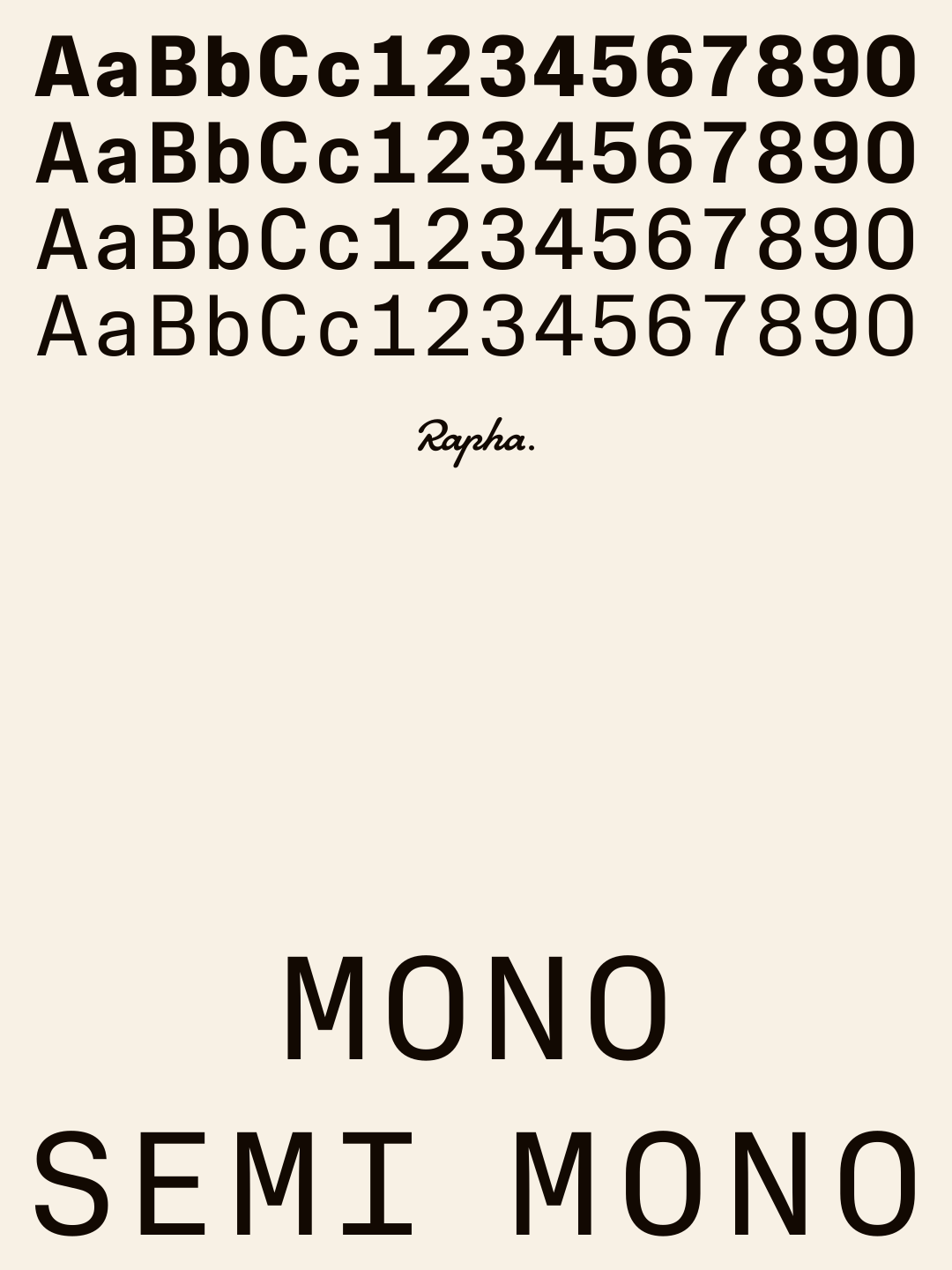
Mono introduced... blah blah. Bespoke type family for Rapha as part of a wider rebrand focused on re-establishing them as the voice of cycling. Shaped through close collaboration and research with Six, the new type family draws on cycling’s visual heritage without being constrained by it. The goal was purpose, not novelty, with every detail designed to bring greater clarity, flexibility, and range to the brand.